Accessibility is an important topic also in software development and nowadays it’s more and more recognized as a real part of software project’s requirements even outside public sector projects. In software development you can start with following Web Accessibility Initiative (WAI) and Web Content Accessibility Guidelines (WCAG) but it’s better to understand accessibility more than just following checklists. That’s why I attended axe-con 2023 which is world’s largest digital accessibility conference. Here are my short notes from selected presentations. The recorded talks are available for registered users at axe-con.
TL;DR;
- Hands-on example of how to use axe DevTools: Extensive Testing and Reporting with axe DevTools
- Hands-on examples for Structuring Accessible Forms
- Examples of how to design for senior users: Ageism in Interfaces
- Ways to reduce cognitive load in web designs by Redesigning for Cognitive Ease
- Update on The State of Accessibility
- How GitHub quantifies the accessibility health: Measuring Ourselves: GitHub’s Accessibility Scorecard
Short recap of a11y tools
- axe Chrome extension
- @axe-core/react / vue-axe
- eslint-plugin-jsx-a11y / eslint-plugin-vuejs-accessibility
- axe DevTools
- WAVE Web Accessibility Evaluation Tools
- NVDA, VoiceOver, TalkBack
axe-con 2023
“Axe-con is the world’s largest digital accessibility conference that welcomes developers, designers, business users, and accessibility professionals of all experience levels to an accessibility conference focused on building, testing, and maintaining accessible digital experiences.”
The axe-con conference is organized by deque which is “the leader in accessibility tools, services and training” and has made great free tools for testing accessibility like axe-core and axe DevTools. Talks at axe-con included case studies from enterprise companies leading in large-scale accessibility efforts, as well as best practices and updates from technology leaders around the world. Nice touch to the conference talks is that they are “well transcriped” and there’s also sign language available.
Here are my short notes from the presentations I found interesting and insightful.
Accessibility at Google: Lessons Learned
Good talk of how in the past ten years accessibility has been grown up from a grassroots effort to a cross-company initiative at Google. And that one of the objectives in OKR is related to compliance and usability or accessibility. The presentation goes through setting up an organization, tools, and resources to help product teams be successful.
Some of the points:
- Introduction to accessibiilty to new employee orientation, hands-on approach.
- Product teams could do assesment themselves
- how to design it
- how to buid it
- how to test it
- Product has: compliance aspect, usability aspect, innovation aspect
- Material Design, defines internal usability standards
“Building with and for the disability community ensures that we’re able to create technology that can level the playing field and make the world a more accessible place.”
DevOps: Top Lessons Learned on Shifting Left For Accessibility and Other Experts
Gene Kim talked generally about which defines winning organizations. The topic was structured around 5 ideals (from The Unicorn Project book):
- Locality and simplicity
- Focus, flow and joy
- Improvement of daily work
- Psychological safety
- Customer focus
“Make tomorrow better than today”
Update on The State of Accessibility
7 steps orgs can take to make a11y core to design & development
- Make it part of your culture
- Implement (and fund) an accessibility policy
- Incorporate accessibility into the design process
- Train developers on accessibility and provide them with an ongoing trusted reference library
- Use automated tools
- Conduct user testing
- Share best practices
With axe DevTools find issues in 72% less time, even though the tool does require some manual work.
Measuring Ourselves: GitHub’s Accessibility Scorecard
Katie McCormick and Kendall Gassner talked about organizational barriers to accessibility and how they tackled it at Github. Slides available.
Accessibility Scorecard:
- “Reliable way to quantify the accessibility health of all of GitHub’s products”
- “How to turn accessibility program’s overall objectives into observable metrics.”
Potentical organization’s barriers to accessibility:
- Technical limitations
- Missing knowledge about accessibility (unintentionally removing accessibility fixes)
- Lacking incentives to prioritize accessibility in roadmaps (motivation)
- Scaling is hard (thousands of engineers, designs and products)
Knowledge – Incentives – Scale => Visibility – Education – Incentives
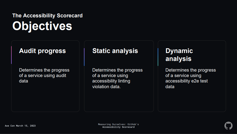
Accessibility scorecard:
- Audit progress
- Static analysis – linting for accessibility violations
- Dynamic analysis – scanning and testing (e2e)
Audit progress:
- Accessibility audit must be requested according to maintenance SLA, issues must be closed in x days depending of their severity
Static analysis:
- All repos are reporting linting metrics to observability software, scored by how many linting rules are disabled
- Linters used: eslint-plugin-jsx-a11y, rubocop-rails-accessibility, erblint-github
Dynamic analysis:
- All URL patterns have test coverage, Zero Axe (axe-core) scanner violations are found, No tests are skipped.
- Internal framework Snek for testing: integrates to Playwright, gathers metrics, alerts teams.
- Run Axe accessibility testing engine in Playwright.
- Automated feedback with Axe scan
Extensive Testing and Reporting with axe DevTools
“Leverage the axe DevTools Browser Extension to perform a comprehensive test of a single page and create reports. The reporting capability is critical for tracking progress and maintaining project timelines.”
Hands-on example of how to use axe DevTools on fake bank web page. Nice tutorial which goes through how you might want test your web page for accessibility and how to interpret the results. Also shows how you can fix and validate the issues in the code like adding aria-label, changing color contrast, marking headings, enabling outlines, using anchors, and adding missing lang attribute.
Deque is planning how to add direct JIRA export of axe report.
Next Generation Accessibility Test Automation
Presentation of Deque’s brand-new platform: axe Developer Hub (beta). Slides available.
- Instantly tell wether a PR will make accessibility better or worse
- Track accessibility status from release to release
- Know which issues to fix first
- Share and export
- Low code implementation
Powered by axe-core, 57% a11y issue coverage, consistent output with other Deque tools (DevTools, Linter, Monitor, browser extension)
- Only available with Cypress, roadmap for JavaScript based tools like Puppeteer, Playwright, etc.
- Only available as SaaS, later potentially private cloud and self-hosted on-premise.
Structuring Accessible Forms
“Forms have a strong semantic structure from labeling controls to ensuring the states of controls are announced by assistive technology.”
Hands-on presentation with code examples at the basics of building a form with different input types, adding in the necessary HTML attributes to link our form elements semantically, sprinkling in ARIA attributes, and handling errors and data validation. Slides / presentation resources available.
Good talk with clear examples and shows how voice-over reads the example form.
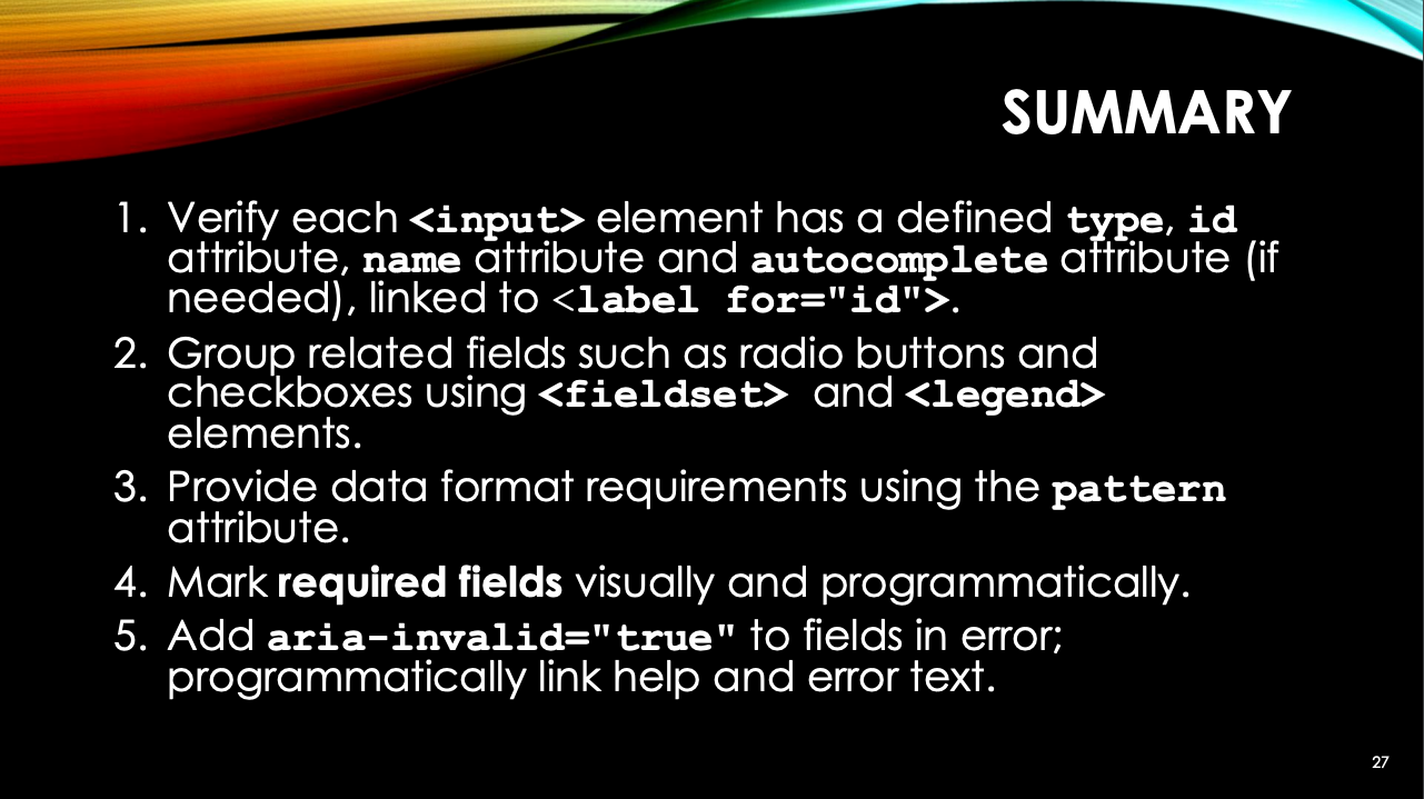
Summary:
- Verify each <input> element has a defined type, id attribute, name attribute and autocomplete attribute (if needed), linked to <label for=”id”>.
- Group related fields such as radio buttons and checkboxes using <fieldset> and <legend> elements.
- Provide data format requirements using the pattern attribute.
- Mark required fields visually and programmatically.
- Add aria-invalid=”true” to fields in error; programmatically link help and error text.
Tools:
- VoiceOver on macOS and iOS
- TalkBack on Android
- NVDA or Jaws on Windows
Ageism in Interfaces
Informative talk of what is ageism and how it affects how technology and interfaces are designed. Slides available.
“The tech workforce is largely comprised of Millennial and Gen Z employees, people who grew up with the internet. There is a bias that comes with this digital immersion, and it’s lead to interfaces wrought with exclusionary assumptions – everyone knows what a hamburger menu is, right?! The Baby Boomer generation has nearly eight times the wealth of Millennials. Yet ageism in tech has led to overwhelm, frustration, and a lack of access to vital technology for people who can actually afford the premium subscriptions we’re selling.”
Ageism:
- Macro (culture, social values, policy)
- Meso (groups and organizations)
- Micro (individuals)
Digital Divide:
- social and knowledge gap with adoption of technology
- associated with negative impact on health, income, civic participation and education
The “Grey” divide:
- Exclusion of older adults from digital technology by researchers, designers, marketing strategists and entrepreneurs
- Self-exlusion from digital technology by older adults
Good examples of different groups of senior users as digital technology user types: non-users, reluctant users, apprehensive users, basic users, go-getters, savvy users.
Opportunity:
- Generational wealth, baby boomers are 10x wealthier than millenials
- Ageign population
Lets do better:
- Independence, autonomy and social connection
- ChatBots are the worst
- Plain language, clear instructions
- Standard patterns, easy navigation and meaningful search
- Clear privacy protection, easy cancellation of services and financial consent
- Label your dang icons!
Additional recommendations:
- Co-design with seniors (not just when prototype is already done)
- Respect WCAG
Beyond Compliance: Best Practices for Designing Inclusive Products
Automotive accessibility expert Hannah Wagner from General Motors weights in on best practices for integrating inclusive design into digital product and experience design. Slides available.
“All too often, ADA compliance is considered the ‘success point’ of accessibility. In reality, compliance is the absolute bare minimum to create a more inclusive world. How do we widen our scope beyond given sets of rules to create solutions that are truly equitable and meaningful?”
- The downfall of designing for the average… solutions that are for everyone and no one.
- Reframing how we thing about solutions: How we can design for individual fit? How can we create solutions that change over time with our users?
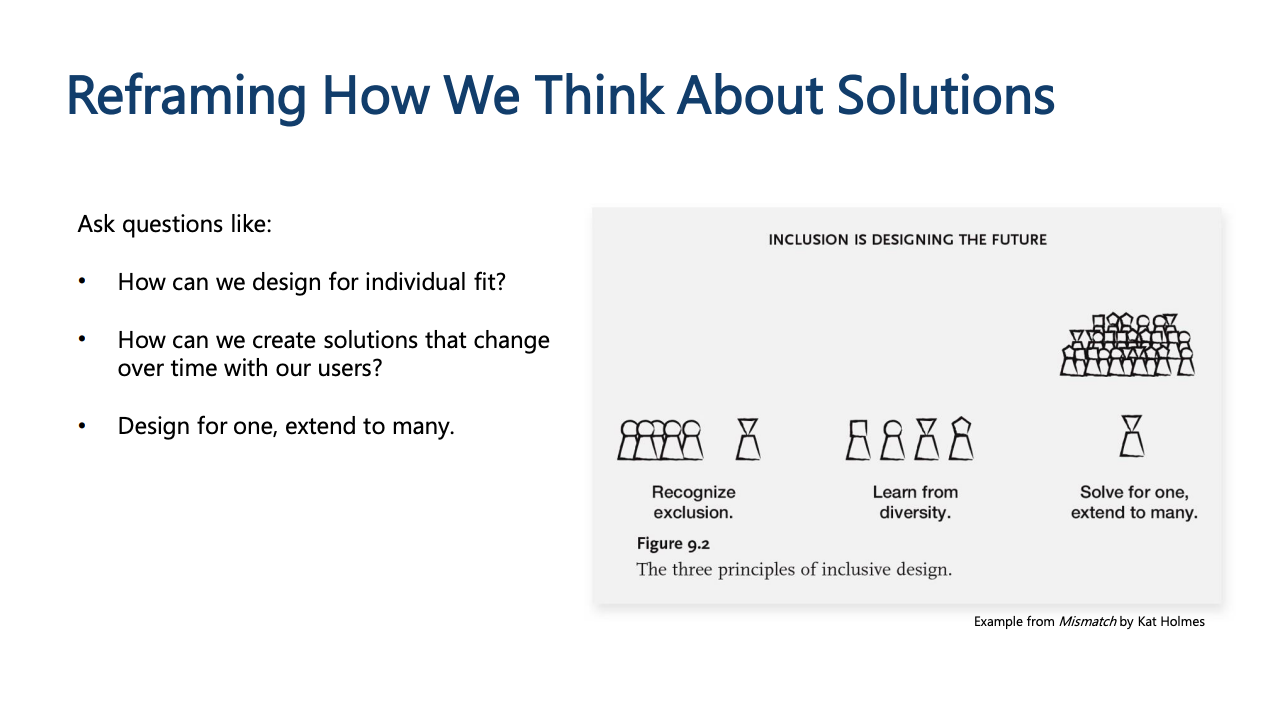
- Design for one, extend to many
- Designing for edge cases helps us innovate
- Design with, and not for
- Co-design
- Avoid shortcuts:
- These cannot substitute a real lived experience: ChatGPT, Experts, Caregivers, Online Reseach, Quantitive data, Disability simulation, User personas.
- Have a ‘get it right’ over ‘get it done’ attitude: pursue accessibility and inclusion for the right reasons
- Design principles: Be mindful of assumptions and hidded biases
- Pursue bite-sized, but ambitious goals.
- Customization is key:
- Create multiple ways for the user to perform an action and to receive feedback. There is not one means of engagement that works for everyone.
- Question whether your idea is truly useful: Empower with privacy, discreation and security.
- Avoid over-engineering
- Prevent advocacy burnout, keep learning
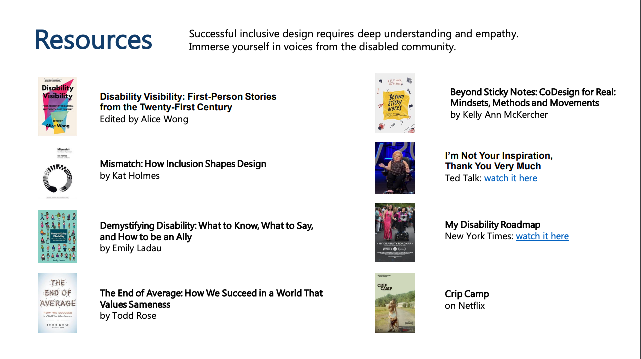
Resources
Redesigning for Cognitive Ease
Alyssa Panetta from University at Albany talks from first-hand experience of providing more accessible experiences for users with cognitive impairments. And tells different ways to reduce cognitive load in web designs. Slides available.
“After all the WCAG standards are met, how accessible is your site for users with cognitive disabilities? How can you tell? What does that mean? Where would you even start?”
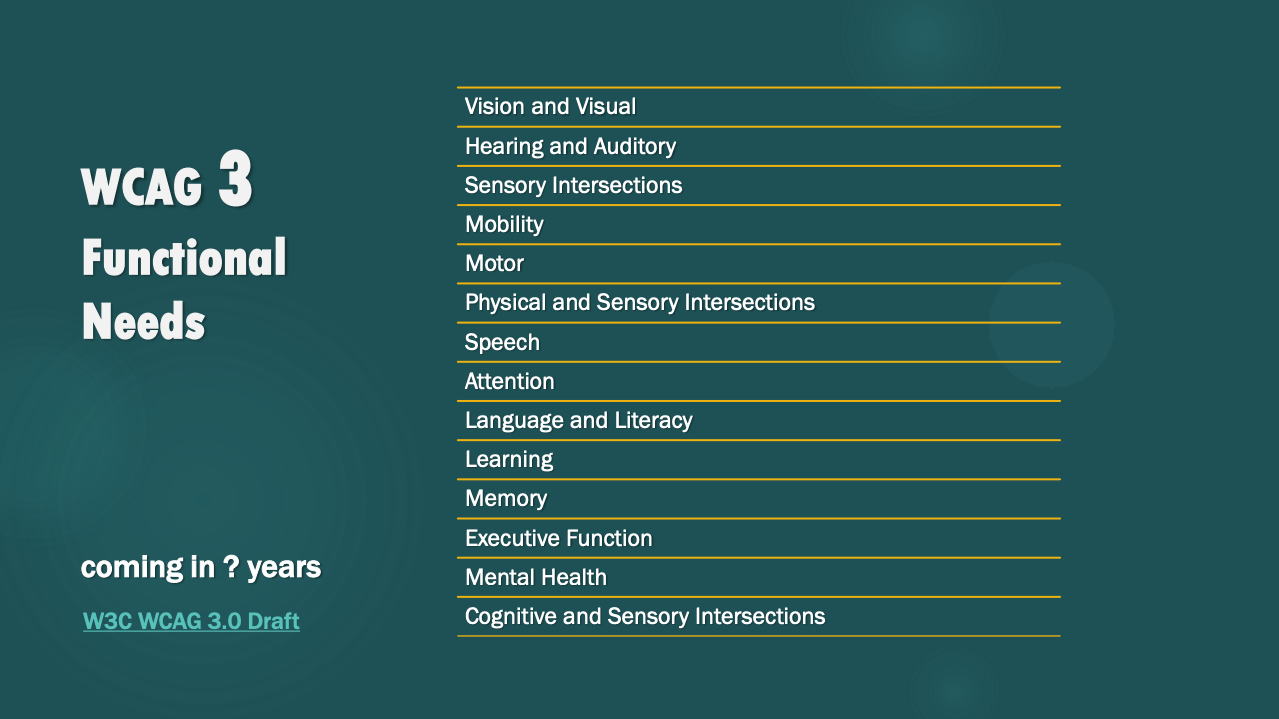
WCAG 3 Functional Needs: 14 which 7 are related to cognition
- Attention, Language and literacy, Learning, Memory, Executive Function, Mental health, Cognitive and sensory intersections.
Examples of functional needs:
- Cognitive: seizure disorder, poor memory, choice dyslexia, constant fatigue
- Sensory: impaired vision, sensitivy to light, sensitivy to motion
- Motor: weakness in dominant side
“For any task to be successful, motivation must equal or surpass cognitive load.”
Microsoft Inclusive Design for Cognitive Guidebook
Video: Building for the Brain: designing for cognitive inclusion
How can we design to reduce cognitive load?
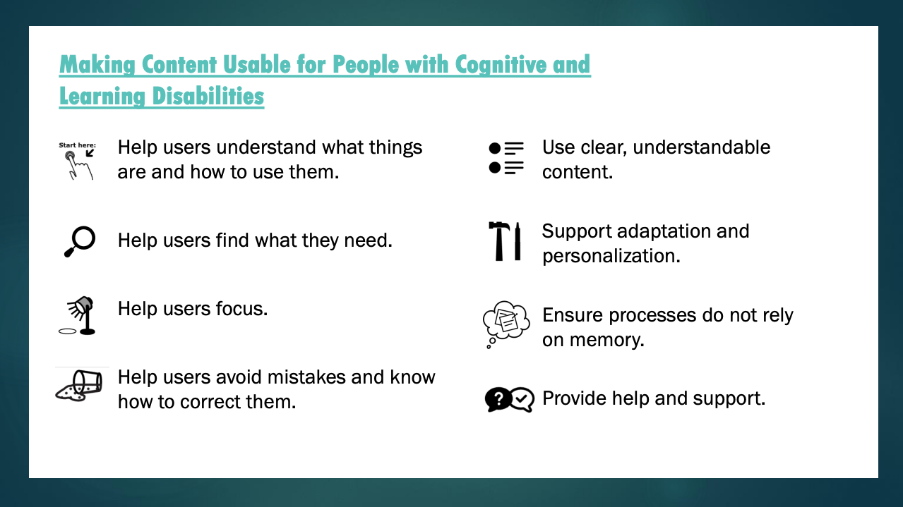
- Make your site easier to use:
- Use semantic HTML and familiar layout patterns
- header, nav, main, section, aside, footer
- Familiar layout, familiar interactions, F-pattern scan
- Use clear headings
- Use modern CSS and make your site flexible
- Relative units, CSS Grid and CSS Math, @preferences queries (reduce motion, dark mode),
- Move beyond viewports with @container queries
- Stay up to date with CSS: moderncss.dev, CSS Weekly, Front-end Focus, CSS Layout News, Kevin Powell, webdev
- Say it twice
- Text and icons together
- Go beyond color alone: icon, color, text, border
- Add motion to grap attention: CSS transforms, CSS transitions, SVG animations
- Use semantic HTML and familiar layout patterns
Resources:
- Notes and Resources for talk “Redesigning for Cognitive Ease” as presented at AxeCon 2023
- Notes and Resources for talk “Living the UX: When a web developer develops a disability”
Summary of axe-con 2023
Plus:
- Good presentations with also hands-on approach
- Recordings available “from the start” (for people not on US timezone)
- Talks were informative and went below the surface to the topic
- Good resources in many talks for further reading
Minus:
- Video quality 720p and examples on i.a. VS Code are unreadable
- Sound quality could be better, has somewhat robotic sound (conference organized as remote setup)
- Captions are helpful but with plenty of typos and mistranscriptions especially on technical terms
Leave a Reply