The operating system running on Jolla has different and refreshing approach to user experience than the mainstream mobile operating systems. Sailfish OS is quite new project which also shows in applications’ user interfaces as common practices are not quite established. There are some guidelines and component usage examples how the applications should be built but they don’t cover every aspect especially with complex applications. Here are some examples how different apps solve common design issues in Sailfish OS.
Sailfish OS user interface design practices
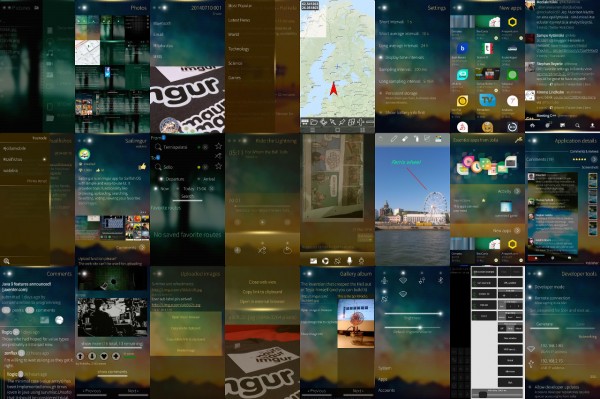
Sailfish OS guides you to make your app to work in certain ways and component gallery in development environment shows some practices but at the end how the app’s flow and user experience really works is up to the developer. There really isn’t comprehensive guide how elements and menu structures should work like there’s for Windows Phone and iOS. And thus Sailfish OS applications’ look and feel are sometimes quite different.
Here are some examples how different user interface aspects are designed in couple of Jolla’s own and third party developers’ apps. The presented examples and comments are just to point out different ways to build the user interface in Sailfish OS applications and doesn’t take a stance on which way is better or how it should be done.
Menu for different sections
There are couple of practices to present a menu for app’s different pages. The default is to use the pull down and push up menus but with more complex apps it’s not enough as the recommendation is to have only couple of items in that menu.
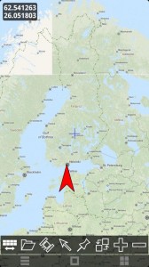
Tweetian (Twitter) uses bottom tab panel and you can flick left or right or press to change the page. In HalfTrail (map + GPS app) different sections are also as icons in bottom tab panel but activate only when pressed. In Haikala (high.fi news) settings page’s can be flicked or pressed with textual buttons.
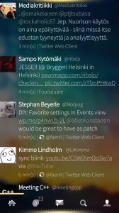
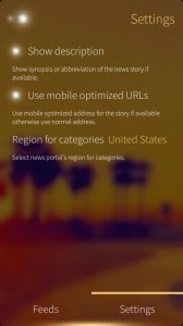
Haikala uses side panel for actions to switch category. IRC uses the side panel for actions to select different IRC channels. Previously also Sailimgur (imgur) used left side panel for navigating to different pages.
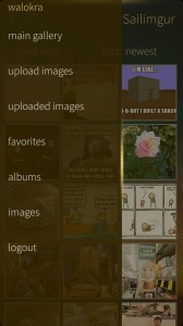
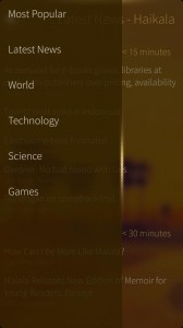
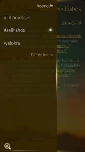
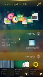
Cargo Dock (file manager) is based on having two different sides and you can copy files between them. Both sides are identical but separate pages. Jolla Store shows links to apps in grid view and also arrows for selecting certain category of apps.
Settings menu
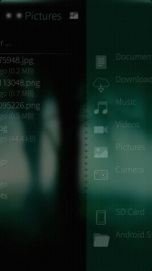
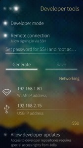
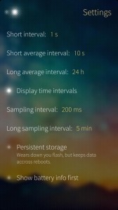
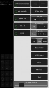
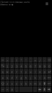
Settings are usually shown in separate page like in Jolla’s Settings and Hunger Meter (battery usage). Terminal app on the other hand uses hamburger menu which opens side panel.
Showing controls and actions
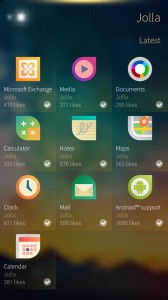
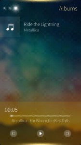
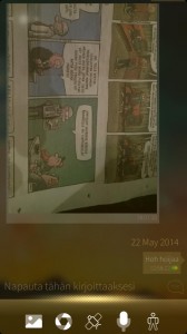
Jolla’s Media app uses docked panel to show controls. The panel is shown only when a song is playing. You can also have docked panel with pull up menu for showing more controls icons. Tweetian has different actions in pull up and pull down menus.
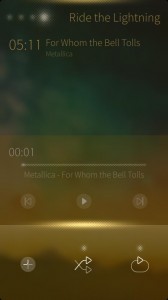
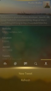
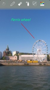
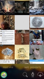
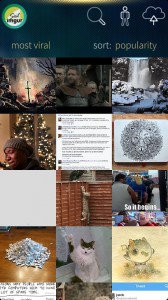
Other common way is to show controls in bottom or top panel with tool icons. This can be seen in HalfTrail with action buttons in bottom toolbar. In Paint there’s a top toolbar with icons. Neither provide legend for icons although Paint has help in About page. MitaKuuluu (WhatsApp) also uses bottom toolbar for chat related actions. In Sailimgur you can choose to have to toolbar at the bottom or at the top. The bottom toolbar has better reachability if used with one hand.

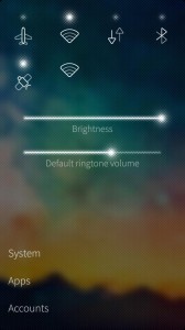
Jolla Settings app uses switches to toggle different features. Terminal app on the contrary takes quite different approach to showing actions and settings. Terminal uses so called Hamburger menu which works quite nicely although isn’t “Sailfish OS” style.

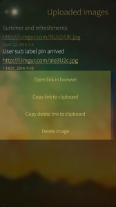
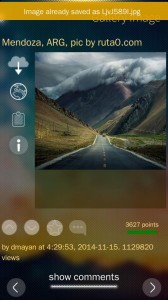
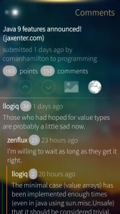
Sailimgur shows actions for the photo when long pressed in a context menu. Actions related to a comment are shown as bottom context menu or icon buttons. Quickddit (Reddit) shows actions as icon buttons.
Back navigation
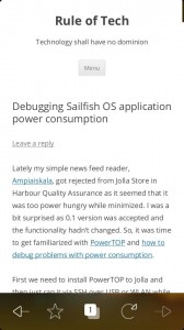
For the back navigation there isn’t a physical button and you either flick left, click page stack icon or use some button and action in pull down menu.
In Jolla’s Gallery app you scroll through photos in slideshow view and you get actions for back navigation only when pressing the photo and opening the Docked panel where you can flick back to the gallery overview. Alternative way for back navigation from photo slideshow is just press the photo as seen in e.g. Jolla Store.
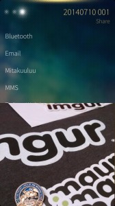
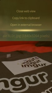
Jolla Opas (Reittiopas) uses simple icon button in toolbar for navigating the route on the map and navigating back. And of course you can have the back navigation in pull down menu like in Sailimgur when navigating back from Web view.

Navigating between items
Navigating between items in a list is normally done by flicking left or right. But sometimes that’s not usable or it’s better to provide also alternative way.
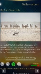
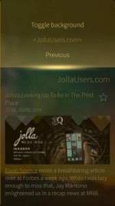
Sailimgur has previous and next buttons at the bottom, Tidings (RSS feeds) provides them in pull down and pull up menus and Browser has them in bottom tool bar as icons.
Search
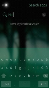
Providing search is usually done as a separate page but it can be put on pull down menu or as normal element in page.
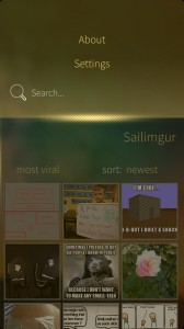
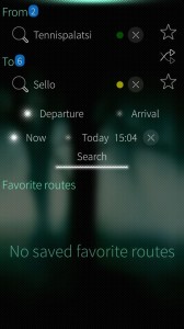
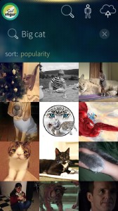
Warehouse (OpenRepos) application has search link in pull down menu which navigates you to separate search page which also shows the results. Sailimgur has the search element in pull down menu and it closes after user presses enter to show the results in main view. Jolla Opas is a route planning app so the search elements are in main page. The search results are shown (if found more than one destination) as blue circle with results number and can be selected in separate dialog page.
Showing gallery of images
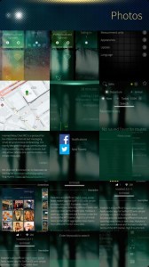
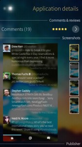
Showing list of images is pretty simple but there are differences how applications do it. Gallery application uses one big grid of cropped thumbnails, Warehouse shows full thumbnail and selection list in side and Jolla Store shows limited list of cropped thumbnails which opens in own view.
Notifications about new features
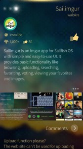
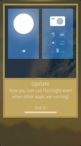
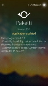
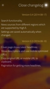
Mobile applications update quite often but users don’t usually check the changelog what’s changed or if there’s new features. So it’s nice to provide a simple changelog in first start like Flashlight, Paketti (post packages) and Haikala.
Leave a Reply